Process
The design process was defined around the double diamond model. Stanford d.school's Design Thinking bootleg was also used as a reference to provide guidance on activities to facilitate a user-centred design thinking process.
Discover
Empathy Development Interviews
Empathy Interviews - “understand a person’s thoughts, emotions, and motivations, so that you can determine how to innovate for them.”
Participants

Insights
Helping the interviewee feel at ease is important
All participants begin the interview by trying to build rapport and create a relaxed atmosphere.
Examples

Note-taking is avoided when trying to build rapport
Some participants mentioned that they do not take notes until they are confident the interviewee is relaxed and there is a sense of trust.
Examples

Structured form completion can create challenges
In cases where interviewers are required to obtain specific information to complete structured forms, they expressed how this made it more difficult to maintain rapport.
Examples
Processing recordings is time-consuming
Participants felt that while audio recording was beneficial in relieving the requirements of note-taking, processing the recording into usable data takes a long time.
Examples

Transparency is important
Some participants felt it was important not to hide anything from the interviewee.
Examples

Encouraging anecdotes is beneficial
Some participants described how they try to elicit anecdotes as a good way of obtaining insights
Examples
It is important to be aware of personal bias
Some participants stressed how going into any interview you always have a personal bias that you should be mindful of.
Examples

Both parties should gain something
Some participants mentioned how the interview should not feel too one-sided and that it is important that both the interviewer and interviewee should gain something from taking part in the interaction.
Examples
Capturing direct quotes is useful
Some participants mentioned the importance of capturing direct quotes from interviewees, however, this can sometimes be difficult to do.
Examples

Audio recording is inappropriate in some cases
Participants who dealt with more sensitive issues said that recording the interview could be damaging.
Examples

Define
Point of View Statements
In order to develop an actionable problem statement, Stanford d.school encourages the design thinker to form their “Point of View” based on their understanding of users and their environments. “More than simply defining the problem, your Point of View is a unique design vision that is framed by your specific users”. In order to do this, they recommend using “Point of View Statements” which take the following structure
The following Point of View statements were developed:
Participant A
Participant B
Participant C
Participant D
Participant E
Participant F
Problem Definition
It was observed that a common theme mentioned by everyone spoken to was the importance of making the interviewee feel at ease. However, the participants mentioned various barriers to this. Note-taking and form completion were mentioned as requirements that made building rapport more difficult. Additionally, keeping track of what had been covered in order to ensure the required information is elicited, and probing the interviewee for more information, were also commonly stated as reasons why having a natural human interaction may be difficult. All participants also expressed the importance of the two-sidedness of the interaction. Many mentioned how they wanted it to “feel more like a chat” and expressed the importance of being transparent and open with the interviewee. Due to the strong feelings expressed by participants about ensuring the conversation feels natural, it was decided that any solution should have minimal impact on the flow of the interaction between interviewer and interviewee. The focus should be placed on making it easier for the interviewer to be present on a human level, displaying positive body language and actively listening to what is being said. Therefore, interactions with the system should be minimised, subtle and unintrusive of the conversation. It was also felt that taking too many notes, particularly where the interviewee would be unable to see the notes, can be damaging to rapport. This can also be the case if an interview is structured in a way that feels regimented and too much like a one-sided question and answer session. Additionally, some participants mentioned the danger of bias in interviewing, particularly in research interviews. They felt that if the questions are not sufficiently open-ended or if the interviewer leads the questioning along a path of confirming their own beliefs, then there is a danger the output of the interview will become biased. Furthermore, due to the nature of data collected from quantitative research interviews, it can be difficult to ensure all data is documented and insights are surfaced without being influenced by personal bias. Taking a recording of the interview to overcome these problems was met with a mixed reaction. Some felt it was a good way to alleviate the difficulties of note-taking and ensure direct quotes can be documented. Nonetheless, others felt it was too intrusive and would damage the sense of trust in the interaction as well as being very time-consuming to process.
Key Pain-points
A key constraint to addressing these pain points is that audio recording can create challenges, since it is felt that it may make the interviewee feel uncomfortable and dealing with raw audio-recorded data takes too long.
User Journey
Based on the identified pain-points, the following user journey was created:
Develop
Ideation
In order to spark ideation, "how might we " questions were generated to frame the problem in different ways to help explore possible solutions. Following the generation of these questions, brainstorming began. In order to carry out effective brainstorming, Stanford d.school recommends that you focus on generating a large number of broad ideas, reserving judgement and imposing constraints where necessary. The “how might we” questions were used as a guide, breaking them down into more focused questions until a question that could be answered was reached.
The following ideas were formed as a result of analysing brainstorming data:
Progress Tracking
A feature that allows the interviewer to define a structure for the interview beforehand, then, during the interview, helps them to keep track of the completion of components and timing by providing visual cues. Additionally, the next component to be covered could be suggested to the interviewer based on the previously completed components and the plan that has been defined. This aims to reduce cognitive load by simplifying the task of determining the path of the interview as well as to mitigate bias by helping the interviewer keep to a predetermined line of questioning.
Segmented Documentation
A feature that allows notes and recordings taken during the interview to be automatically segmented into corresponding interview components (e.g. questions, topics, form sections) creating a more structured and uniform account of the proceedings that facilitates faster access to specific information. This aims to reduce cognitive load by taking care of the structuring of notes, mitigate bias by helping the interviewer capture a more indiscriminate account of the interview, and reduce the time taken to process and search audio recordings.
Open Questioning Analysis
A feature that automatically determines if a question an interviewer plans to ask is open or closed. This aims to mitigate bias since it has been found that the line of questioning chosen by the interviewer is a common source of bias.
Bias Reflection
A feature that aims to help interviewers be more mindful of their own bias, by asking them to predict what they think the participant might say in response to a given question, i.e. explicitly stating their bias, then reflecting on how their answer may be surprising and if it has changed their point of view. This feature would not be appropriate for all types of interviews but, based on empathetic data, it is felt it may be useful in areas such as qualitative research. This aims to mitigate bias by transforming personal bias from being something in the interviewer's mind that they try to suppress to something that is acknowledged and forms part of the data itself.
Systematic Insight Surfacing
A feature that facilitates a systematic approach to analysing qualitative data such as Thematic Analysis to allow the user to surface insights more objectively. This aims to mitigate bias by allowing the user to ensure that all data is taken into account when surfacing insights and that they are not influenced by their own bias in selecting pieces of information.
Deliver
To explore how the generated ideas could be combined, they were mapped onto the user journey like this:
Based upon the empathetic data, the following flow diagram showing how information is passed along current processes was determined. This is a generalisation of all the types of interviews explored, with items that did not apply in all cases shown in brackets.
These existing processes should be considered when designing the tool, in order to ensure the tool can be integrated into workflows and is non-specific to particular use-cases. Based on this, the following user journey was established, incorporating the ideas into a single user experience:
Prototyping
In order to test these ideas, a high fidelity prototype was developed using React. It was decided to structure the development of the prototype in sprints, focusing each sprint on a particular feature and defining a user story based on empathetic data, to ensure that the development was grounded in solving real user problems. User stories are a concept borrowed from Agile methodologies that provide “short, specific and goal-oriented” statements that tend to take the form “As a..., I want..., so that...”
Sprint 1 - Progress Tracking
User Story: As a social worker, I want a tool for organising and monitoring the progress of my assessments so that I can focus on being present with the service-user.
Participant B, a social worker, is required to complete a structured form for each of their assessments with service-users. They expressed how it was important to them that the session feels“more like a chat” to help the service-user feel comfortable discussing sensitive issues. Because of this, they do not tend to complete the form in order, instead, completing it in the order that feels most appropriate to the flow of discussion in each case. However, this creates difficulties in identifying sections that still need to be completed and confirming that everything has been covered, since the form is many pages long and requires them to go through each page checking each section. Due to the strict time limits and the importance of ensuring all information is covered during the session this creates additional stress, increasing the cognitive load and making it more difficult to build the rapport that is vital in situations such as social work.
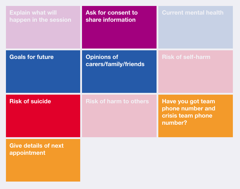
The key pain point established in this situation was the difficulty in identifying components of the session that were yet to be covered, and by extension concluding that all components had been covered. Working closely with Participant B, the idea of using a touch screen device to allow the user to discreetly dismiss components as they are covered was experimented with. Following the definition of a set of components, the user is able to start a session using the predefined components. The components are then displayed on-screen as large buttons and the user is able to tap each one when the component is covered. It then fades or disappears, depending on the user’s preference, meaning identifying components yet to be covered can be achieved through glancing at the screen. The components can also be colour-coded by the interviewer to provide instantaneous visual information about the type of component.
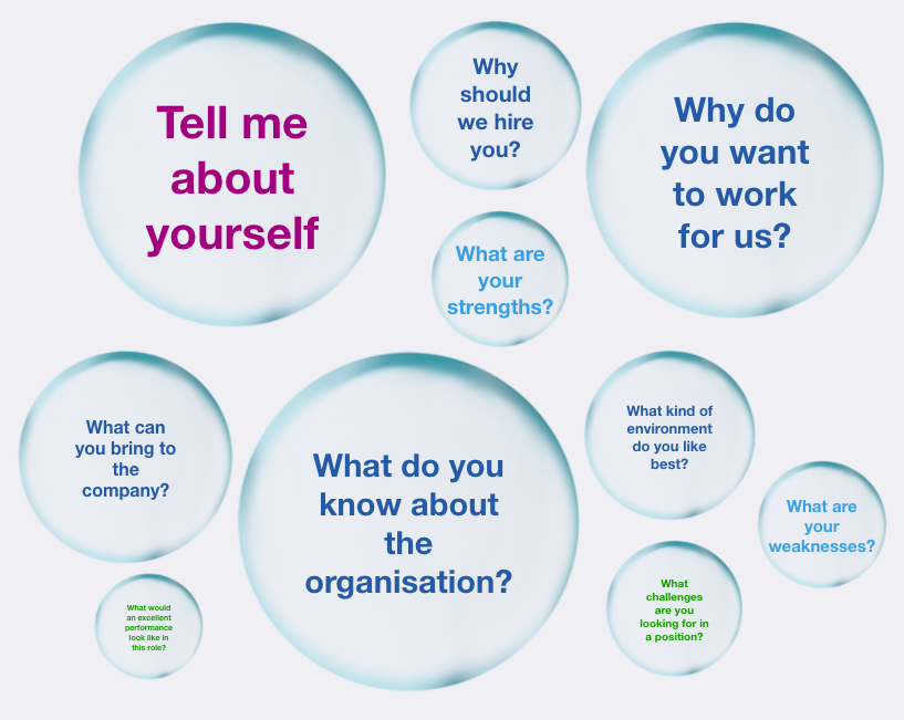
As an extension to this idea, an additional view was added which displayed components as a set of rendered bubbles, which were sized according to which component should most likely come next based upon the predefined plan. This was an exploration into the incorporation of playful design into the tool, which aims to “make existing activities and systems more engaging by infusing them with the engaging qualities of games and toys. When discussing his three levels of emotional design, Don Norman explains how products that perform well on the reflective level should be fun to use and provide the user with a story they can tell about it’s novelty. The idea of using bubbles was developed by considering the action of the interviewer tapping a component to complete it, then it disappearing or fading as being similar to popping a bubble. It was also felt that the unordered nature of a group of bubbles could accentuate the sense of fluidity in allowing components to be completed in any order. Participants generally liked this idea and while they felt it may not be appropriate in all cases, some mentioned how it could be useful in making the interview more collaborative and transparent by altering the roles of the interviewer and interviewee to allow them to work together to pop all of the bubbles. Participant F spoke about the potential benefits of introducing a sense of motivation and achievement into the process and agreed it could be useful in conducting research interviews with children. Exploring the effects on rapport of reimagining interviews in this way could be a future area of research.
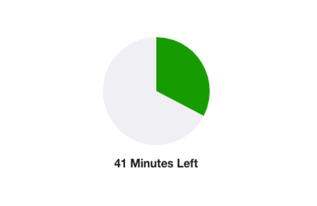
Participant E described how they make use of a TimeTimer™ during their interviews, which provides a simple visual representation of time remaining. The concept is widely celebrated in the design world for its fast interpretability compared to using clocks or stopwatches. It was therefore decided to add a similar style of countdown timer to the UI to allow the interviewer to keep track of time remaining without disrupting the discussion.
In order to evaluate the feasibility of this part of the prototype, user trials were carried out in which participants were to complete tasks using the system. The technique of “Show, don’t tell” was used meaning the facilitator should only give the participant “the basic context they need to understand what to do” and refrain from “correcting” misunderstandings. Additionally, the participants were encouraged to “Think aloud” to help empathise with their understanding of the system. These techniques are all outlined as part of the methodology for design thinking user testing by Stanford d.school. While the facilitator observed the proceedings, they completed a “Feedback capture matrix”. As defined by Stanford d.school, “feedback capture matrices facilitate real-time capture of feedback on presentations and prototypes”. The matrix helps the design thinker arrange thoughts into four categories: likes, wishes, questions raised and ideas spurred on.
During the trials for the component tracking tool, the users were able to complete the task with relative ease. They expressed a liking of the use of colour as well as the timer to give quick visual cues. The option of fading the components when they are completed was preferred over hiding them as it allowed them to keep a record of what had been previously covered. While they liked the colour coding, they expressed a desire to split components into more distinct categories to represent the stages of the interview, as well as the ability to make some components higher priority for completion than others. Therefore, the ability to group components into stages was added and components could be given importance of “Highest”, “High”, “Medium”, “Low” or “Lowest”`.
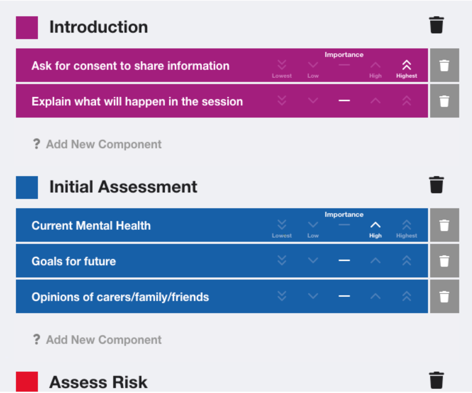
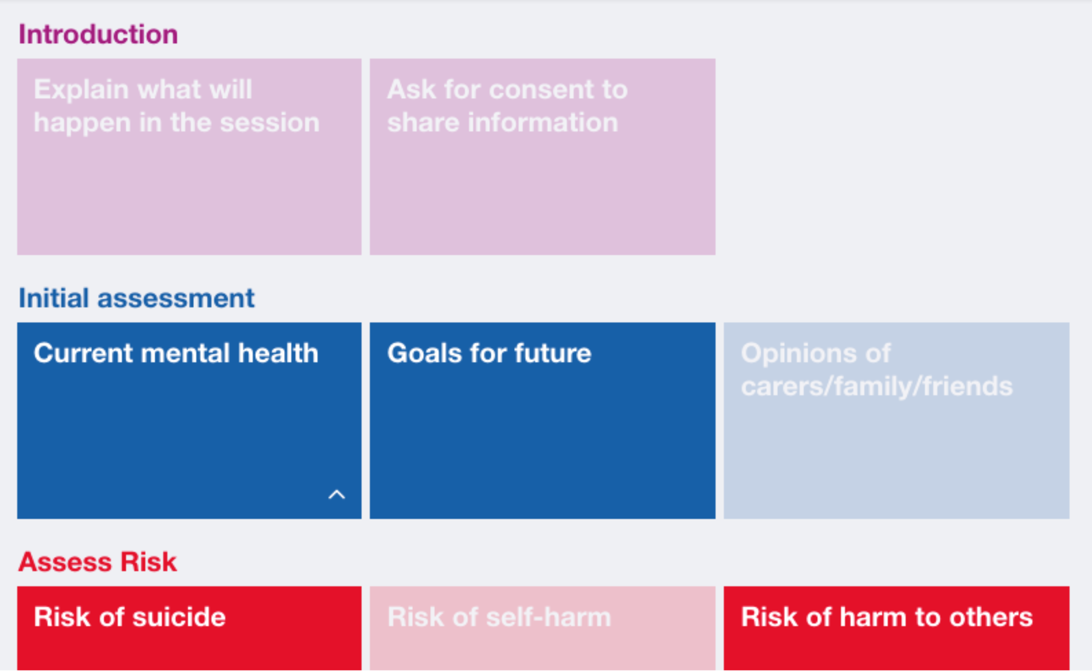
Overall, Participant B felt that this would be useful in their work to keep track of sessions and also mentioned how having a structure of sessions, which could be defined by NHS policymakers, could be beneficial in providing a better quality of care by standardising the approaches used by practitioners.
Sprint 2 - Segmented Note Taking
User Story: As a hiring manager, I want a note-taking tool that helps me collect and manage my interview data more easily.
Participant A, a hiring manager, takes written notes during job-fit interviews to allow them to provide feedback afterwards. They expressed that they often found it difficult to ensure that these notes were complete and well organised whilst also maintaining a natural conversation with the interviewee and building a rapport. Additionally, Participant F, a recruitment lead, explained “I tend to have a pen and paper ready, but I try not to use them. My primary focus is to build a personal connection”. In these cases, it seems that building a rapport and ensuring the conversation flows naturally is prioritised over producing an account of the interview that is going to be easy to process afterwards.
Building on top of the progress tracking tool developed in sprint one, it was explored how note-taking could be added to the tool. The participants, who currently mostly take notes on paper, largely ruled out the use of a laptop, because of the noise the keyboard would make and felt that the upright screen would form a barrier between themselves and the interviewee. However, they were comfortable with the use of a small tablet such as an iPad with an on-screen keyboard to take notes electronically because interactions would be silent and the smaller size of the device would be less intrusive. Various ideas were experimented with such as typing notes in pop-up boxes that appeared when a component is selected or thinking about component objects as being 3D cards that can be flipped and responses written on the other side. However, participants found these concepts to be unnecessarily complex and they did not like how notes were hidden after they had been taken. The preferred design was a more simple chronological account of the completed components with notes appended beside each one. The design made use of negative space to remove any sense of restriction in the length of notes that could be taken, with some participants explaining how it felt close to taking notes on paper.
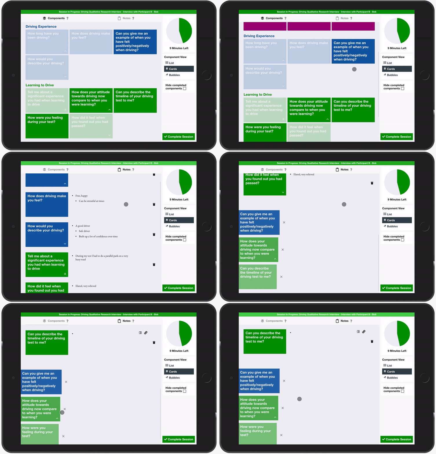
The initial design challenge that led to the development of the rejected pop-up box and flip cards solutions was due to a lack of screen space on a small tablet display meaning notes were hidden away when not in use. This was overcome by introducing two separate tabs to the display, one showing the components and the other showing the notes. When a component was selected from the component tab, the focus was automatically shifted to the notes tab with the new component appended to the end of the chronology, ready for the user to add notes. While the users appreciated the amount of screen space being dedicated to note-taking, they felt that it was distracting and laborious for them to have to switch between tabs each time they wanted to start a new component. To combat this, a set of three suggested components was added to the bottom of the notes tab to allow for fast access to the predicted next component. The suggestions were determined based upon the current stage of the interview and the priority given to the upcoming components.
In terms of the structure of the notes that were taken, initial implementations included a full rich text editor that would allow the interviewer to format their notes, changing font size, changing font weight, adding lists etc. However, this was observed to be redundant with many participants preferring the use of a simple bullet-pointed list. Therefore, the rich text options were removed, in favour of a bullet-pointed list of individual notes that can be indented to create a hierarchy.

Finally, it was suggested by Participant C that it would be useful to be able to link a note taken for a particular component to a different component since respondents will often mention information relating to topics which may have already been discussed or are yet to be discussed. This was added by allowing notes to be added to other components via a link button. This was found to be useful particularly when linking questions together, which is a skill many interviewers employ to help the conversation to feel more natural. For example, as show in the image, the user has linked a note taken for a question about the interviewee’s strengths to a question about an achievement the interviewee is proud of. This could serve as an aid to linking their phrasing of questions since they could say something like “You mentioned you are very ambitious and quite an over-achiever, please can you tell me about an achievement you are proud of?”
Sprint 3 - Segmented Audio-Recording
User Story: As a magazine editor, I want an audio recording tool that helps me find the information I’m looking for more easily.
Participant D, a homes editor of a magazine, conducts interviews with homeowners to create features. They take an audio recording of the conversation using a digital recorder as well as taking brief handwritten notes. However, they find processing the recording very time-consuming. They explained how they sometimes relisten to the recording of the interview three or four times to familiarise themselves with what was said, using their commute in the car to do so via a USB stick. When they come to write up the piece, they “usually remember the essence of what they said, but finding the exact words in a recording that can sometimes be more than an hour long is quite hard and time-consuming”.
In a similar way to segmenting the notes into corresponding components, audio recording was integrated into the component tracking tool, using the information generated by the user when they tap a component to automatically timestamp the recording with the start times of each component. This meant that when reviewing the recording, this metadata could be used to allow the user to find specific information more easily.
Firstly, some participants who dealt with more sensitive issues ruled out the use of audio recording because they felt it would be inappropriate and damage trust. Therefore, an option was created to completely disable audio recording features for a particular session plan. Additionally, all participants who currently use audio recording felt that it was important to ask the interviewee’s permission to record the conversation and explain how the recording would be used before they started recording. Therefore, the decision was taken that even when audio recording is enabled, the default option would be that the recording would not be started automatically when the session starts. Instead, the interviewer is able to start the recording manually, by pressing a button on the session screen. This also meant that the interviewer was able to take multiple recordings throughout the conversation, meaning it could be used as a tool for relieving note-taking requirements in specific moments.
Due to the focus placed on trust and transparency, it was felt it was important to provide strong visual indicators and feedback regarding whether or not the conversation is currently being recorded. Learning from the Apple iOS UI design pattern of changing the colour of the status bar at the top of the screen to unobtrusively indicate current background processes such as the use of location (blue), on a call (green) and screen/sound recording (red), the decision was taken to change the bar at the top of the UI to red to indicate recording has been started. When showing this to participants, they also felt it would give them the peace of mind that the recording was working and they could focus on the conversation instead of taking notes. Additionally, it was felt that feedback regarding the audio levels being recorded would be useful, to allow the interviewer to be sure both parties could be heard when the recording was played back. To cater for this, a waveform was added, taking the place of the start recording button that gives real-time feedback of the audio levels being recorded. Given more time and based on the feedback that was received, it could be beneficial to dynamically provide an indication of the optimality of the levels, i.e. whether they are too quiet or too loud.
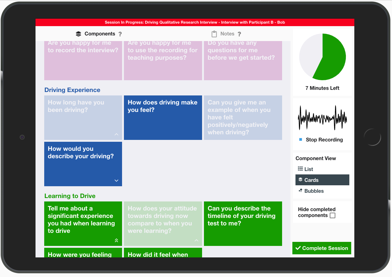
The following video shows audio being captured in an example interview

In order to allow the user to listen back to recordings, the documentation review screen was extended to include an audio player. It was felt by participants that it was important to be able to see corresponding components and notes alongside the audio currently being played, therefore, the favoured design for the audio player was a vertical progress bar alongside the notes with colour-coded markers where each component begins. To reduce the interaction required to review the recording and notes, the notes section of the interface was adapted to automatically scroll in time with the audio meaning the notes displayed would always correspond to the audio being played. The participants were impressed by this feature and felt it would be useful in allowing them to focus on the audio then check the notes when necessary. Additionally, to facilitate skipping the audio to a particular component, the component cards and markers could be clicked to automatically seek the audio to the moment that component began. Participant D, a magazine editor, particularly liked this feature and explained how “it would be so handy to be able to fast forward to a section of the interview so I could use an exact direct quote in my feature”.
The following video shows the example audio being reviewed
Sprint 4 - Open Questioning Analysis
User Story: As an academic researcher, I want to ensure that when interviewing I am mindful that my line of questioning does not lead the interviewee into confirming my own bias.
Participant C, an academic researcher, feels that it is very important to ensure that their line of questioning remains open in order to ensure that the interviewer does not lead the interviewee into confirming their personal bias. They try to ask very high-level, “almost abstract” questions to gain insights rather than asking specific questions.
With this in mind, providing assistance in ensuring that planned questions were open was explored. After researching online, a publicly available dataset was found containing around 1.4 million questions taken from amazon.com, each labelled as being either open or closed. This was then used to create an NLP algorithm that used the Python parts-of-speech library, spacy, to identify patterns of auxiliary verbs, adverbs and other key signifying words in open questions and closed questions. In order to implement this, a training sample of 210,000 questions was taken from the dataset, which was processed, grouping by the pattern of keywords in the first 6 words of the question. Then, for each pattern, the proportion of open questions was calculated. For example, the pattern "did * have * * *" (where * represents a word that is not an identified keyword) has a proportion of open questions of 0.3, whereas the pattern "how would * * * *" has a much higher proportion of 0.98. This shows how the model would favour the rephrasing of a closed question such as “Did you have a good experience?” to a more open question such as “How would you describe your experience?”. In order to generate a prediction for a given question, the pattern which matches the most keywords is found, giving the corresponding proportion of open questions in the dataset as the confidence the question should be classified as open. This achieved an accuracy of 78.5% on a testing sample of 21,000 questions. 74.7% of open questions were given an open confidence value of more than 0.5 while 82.8% of closed questions had an open confidence of less than 0.5.
In order to integrate this into the prototype, it was added to the component creation screen to ensure that bias mitigation is considered during the initial planning stages of the session. It was felt that the assistance should be fairly unobtrusive and unrestrictive in terms of indicating to the user the prediction, however, allowing them to dismiss this and proceed, even if the question was deemed to be closed, since in some cases it may be necessary to ask closed questions. Additionally, it was felt that it was important to present the prediction with an air of uncertainty so it was made clear the prediction was a best guess and may be incorrect. Based on this, the phrasing of the messages to the user was decided to be “This looks like it could be a closed question.” and “This looks like an open question.”. The confidence value was also displayed to give the user an indication of how certain the prediction was, which was also colour coded to allow the user to understand the sentiment behind the message, i.e. closed is negative, open is positive.
Sprint 5 - Bias Reflection
User Story: As a qualitative researcher, I want to ensure that I am mindful of my own bias when interviewing.
Participants C, E and F who all conduct qualitative research interviews, spoke of the importance of being aware of their own bias throughout the process. Participant E explained how “everybody’s got bias coming into something, whether you think you have or not, you have, and you want to be reflective of what you're hearing fully”. Participant C explained how they “don’t like over-preparing for interviews” since they feel that too much preparation biases their thinking.
With the goal of altering the perception of personal bias from something that researchers attempt to suppress, into a feature of the data that is acknowledged and reflected upon, the following methodology was devised:
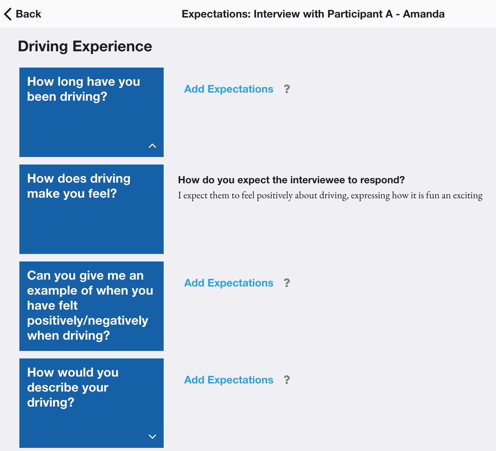
Using this method, the researcher would declare what they expect the interviewee to say for specific parts of the interview, i.e. explicitly declaring their bias. Then, following the interview, they would be presented with their expectations alongside the actual data in order to allow them to reflect on whether their bias was confirmed by the interviewee. This was integrated into the prototype by allowing the user the append expectations to individual components for a particular session. These expectations are then hidden while the interview is carried out, before allowing the researcher to compare their data to their expectations and reflect on any differences by answering some simple questions
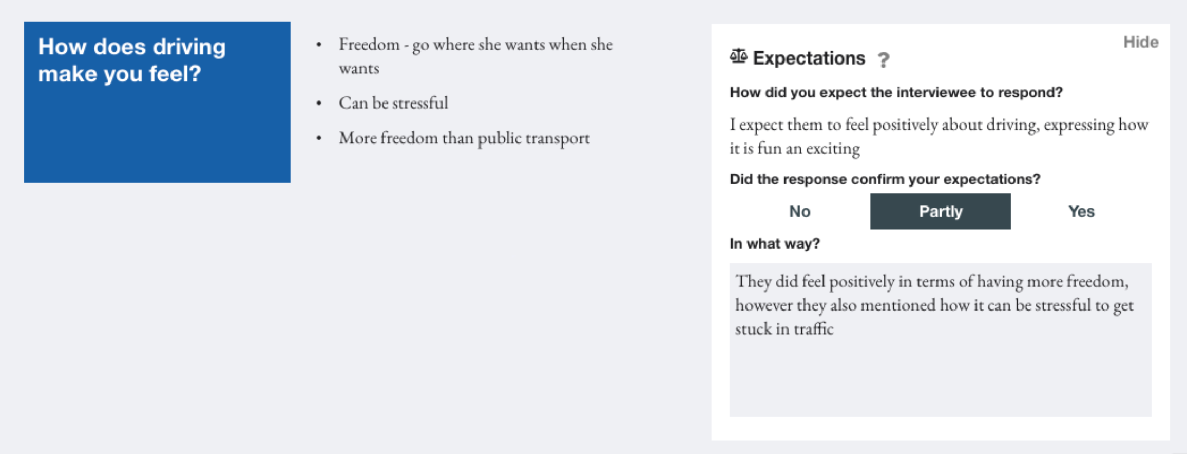
When receiving feedback on this framework, participants felt that while it could be a useful tool in acknowledging their personal bias they were sceptical about the feasibility of declaring expectations for each individual session they carried out. Participant F suggested archetypes could be used to generalise expectations, assigning an archetype to individual sessions. Additionally, they felt that the tool could be reframed as a tool for hypothesis evaluation, meaning the expectations become a hypothesis that is to be proven or disproven by a set of interviews. They felt this could be useful in “ensuring the original angle is maintained” while acknowledging where preconceived ideas may have been incorrect.
Sprint 6 - Systematic Insight Surfacing
When discussing the evaluation stage of a set of qualitative research interviews, Participant E described this as the “the messy bit”. They explained how it can be overwhelming to be presented with large quantities of subjective data and attempt to process it into something concise and usable. Additionally, it was felt that if a systematic approach is not taken, the researcher can be led into confirming their own bias by selecting insights that support it. Therefore, it was decided that the tool should facilitate a more objective, systematic approach to synthesising data to surface insights. Thematic analysis was selected as the analysis method to implement since it is seen as “a foundational method for qualitative analysis” and it provides the necessary flexibility to be applied to a variety of use cases.
In their 2006 paper, Braun and Clarke set out a step-by-step guide for doing thematic analysis. The first phase is to familiarise yourself with the data; it was felt this was enabled by the documentation review interface produced in sprints 2 and 3 that shows the user segmented notes and audio recordings. The second phase is to generate initial codes which represent a feature of the data, systematically going through the entire dataset. This was integrated into the documentation review interface by adding an expandable “thematic analysis codings'' tab below each component, where codings can be appended and previously added codings enabled and disabled. Based on the application of qualitative research, codings are defined at a session plan level, meaning that parallels can be drawn between sessions. However, in future it may be useful to allow the user to perform analysis for individual sessions or specific groups of sessions.

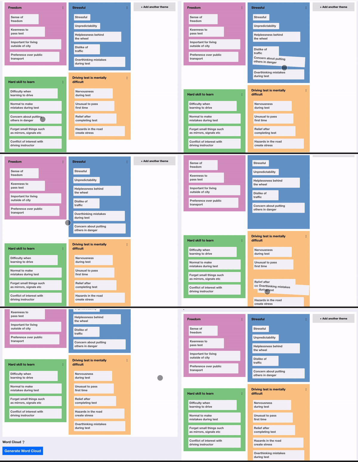
Following the generation of codes, the researcher should have a long list of codes that have been identified. Braun and Clarke explain how they should now begin “sorting the different codes into potential themes''. They explain how “it may be helpful at this phase to use visual representations”, suggesting writing the name of each code on a piece of paper and experiment with sorting them into overarching themes. Therefore, it was decided to design a user interface to reflect this. A drag and drop interface was used, where the user can create new themes which appear as coloured areas of the screen then fluidly move codes between themes, reflecting sorting pieces of paper into piles. Additionally, a count was given for each theme, so the researcher could see how prevalent a particular theme is. This can be used to facilitate the next phase of the process, reviewing themes, by allowing them to consider removing themes that do not have sufficient data to support them. Additionally, at this stage, the researcher should consider collapsing themes into each other, where “two apparently separate themes might form one theme”. In order to facilitate this, it is felt that a future enhancement could be to allow the user to explore the underlying data for a particular theme rather than going back to the notes and looking for corresponding codes. This could be done by displaying a subset of the data that applies to the theme so it can be reviewed more easily.
Once the researcher has reviewed the themes, they should “define and refine” each theme, identifying the essence of what each theme is about. This is enabled in the prototype by allowing the user to update the description of the theme as it is refined, however, again, a view to examine the data for a specific theme would be beneficial to this phase. Finally, the researcher should produce a report of their themes. The final arrangement of codes into themes can be extracted from the interface, however, it was felt it would be useful to provide an automated generation of a visualisation of the themes and codes. A word cloud was selected since it provides a “straightforward and visually appealing visualisation method for text”. This was integrated into the prototype by adding a button below the thematic analysis theme exploration to generate a word cloud. When clicked, this takes the current configuration of codes and themes and generates a word cloud with the names of the themes and codes sized by their frequency in the data. Participants liked how this instantly provided a visual, easily understandable overview of the parallels of a set of findings. It was mentioned how removing the chronology of the data allowed them to interpret the data more objectively since the immediately noticeable information was now the most prevalent rather than the first topic covered by the interviewer.
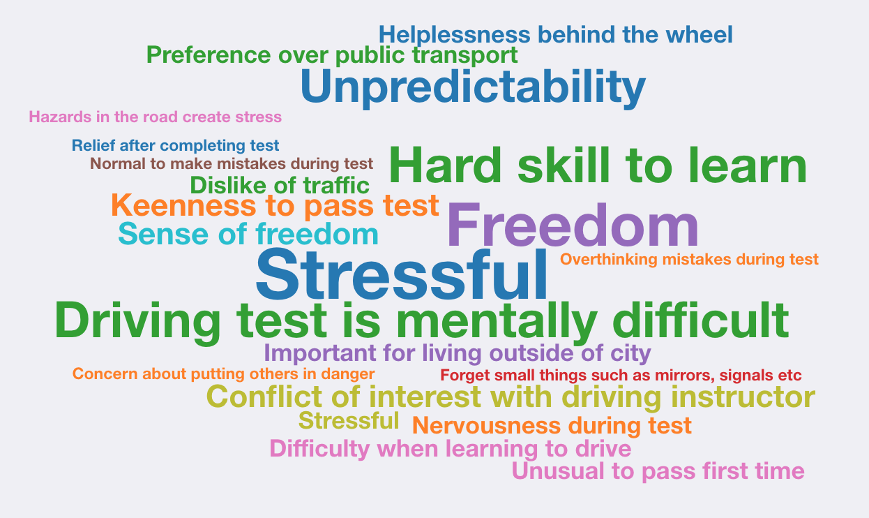
While this feature was designed with a focus on qualitative research, Participant A, a social worker, also felt this would be beneficial to them in identifying the key themes discussed in a session. Throughout the process they mentioned how they have very little time to do extra preparation or analysis of their sessions but felt this would provide them with a quick method of reflecting on a session, using recurring codes and themes to connect ideas that have been developing between sessions. They gave the example of identifying a service user’s “rules for living” in cognitive behavioural therapy and felt that this method could help them to process all the information collected more systematically. They also felt that the word cloud could be an empowering tool for service-users to see the themes they discussed in a session and felt it could be useful in identifying a progression from session to session as language changes and themes become more/less prominent.
