BuzzFeed News Offline Experience
Internship Project
Summer 2018
UX Design
Rapid Protoyping
Fullstack Web Development
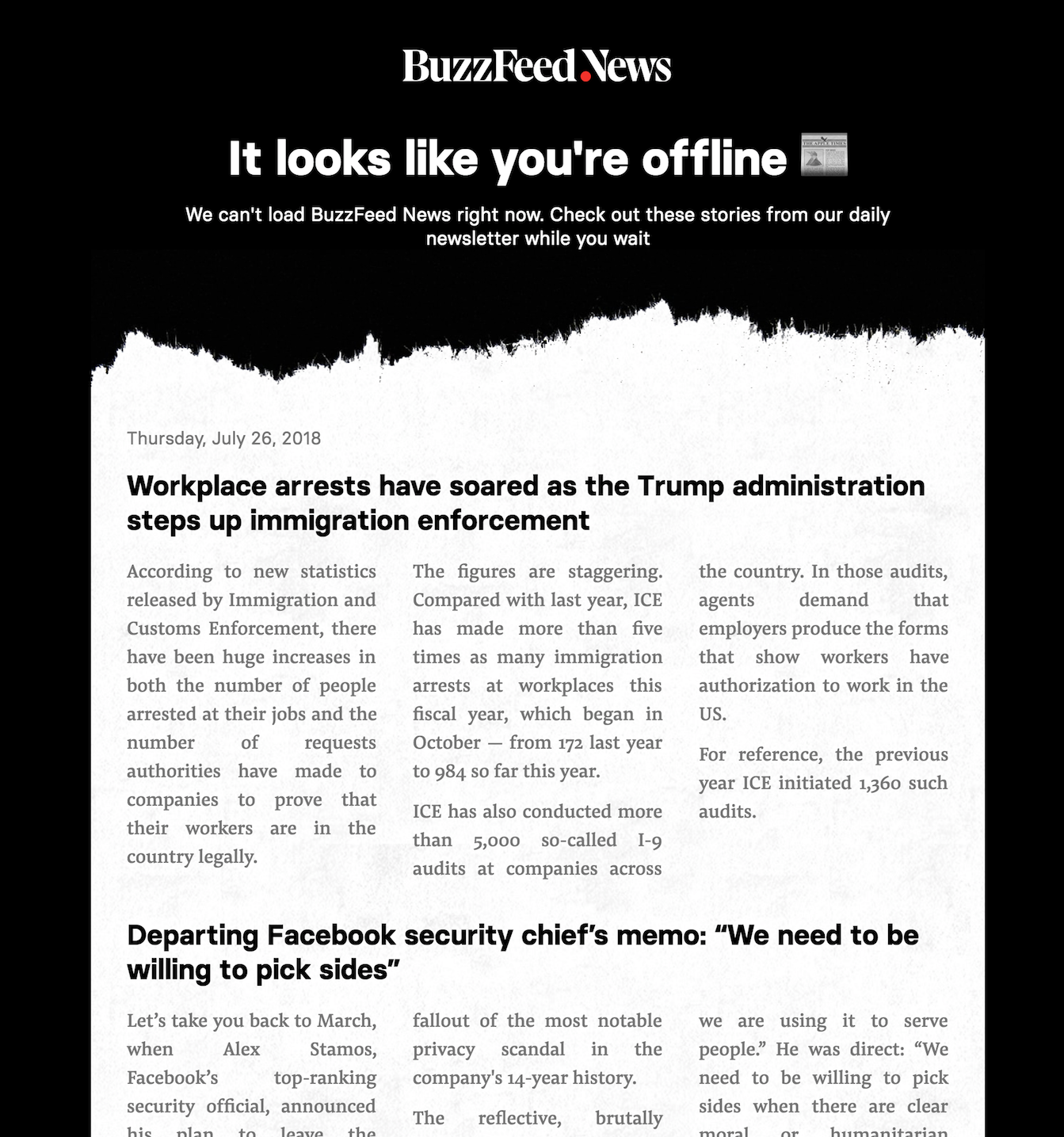
During my internship at BuzzFeed I joined the BuzzFeed News team in the final weeks before the launch of buzzfeednews.com, a dedicated news location helping BuzzFeed create a new identity for it's more serious journalism content. Towards the end of my internship I was given the opportunity to work on a new concept for the offline page of the site. Working closely with design, engineering and the news team, I created a prototype of an offline experience that allowed a round-up of the latest news to be consumed without connection to the internet. The daily content was taken from BuzzFeed's daily newsletter, cached on the user's device then served to the user when they lost connection. To add a playful element to the idea, the roundup was styled as in a way that is reminiscent of a newspaper, to reflect the offline, daily update nature of the content.
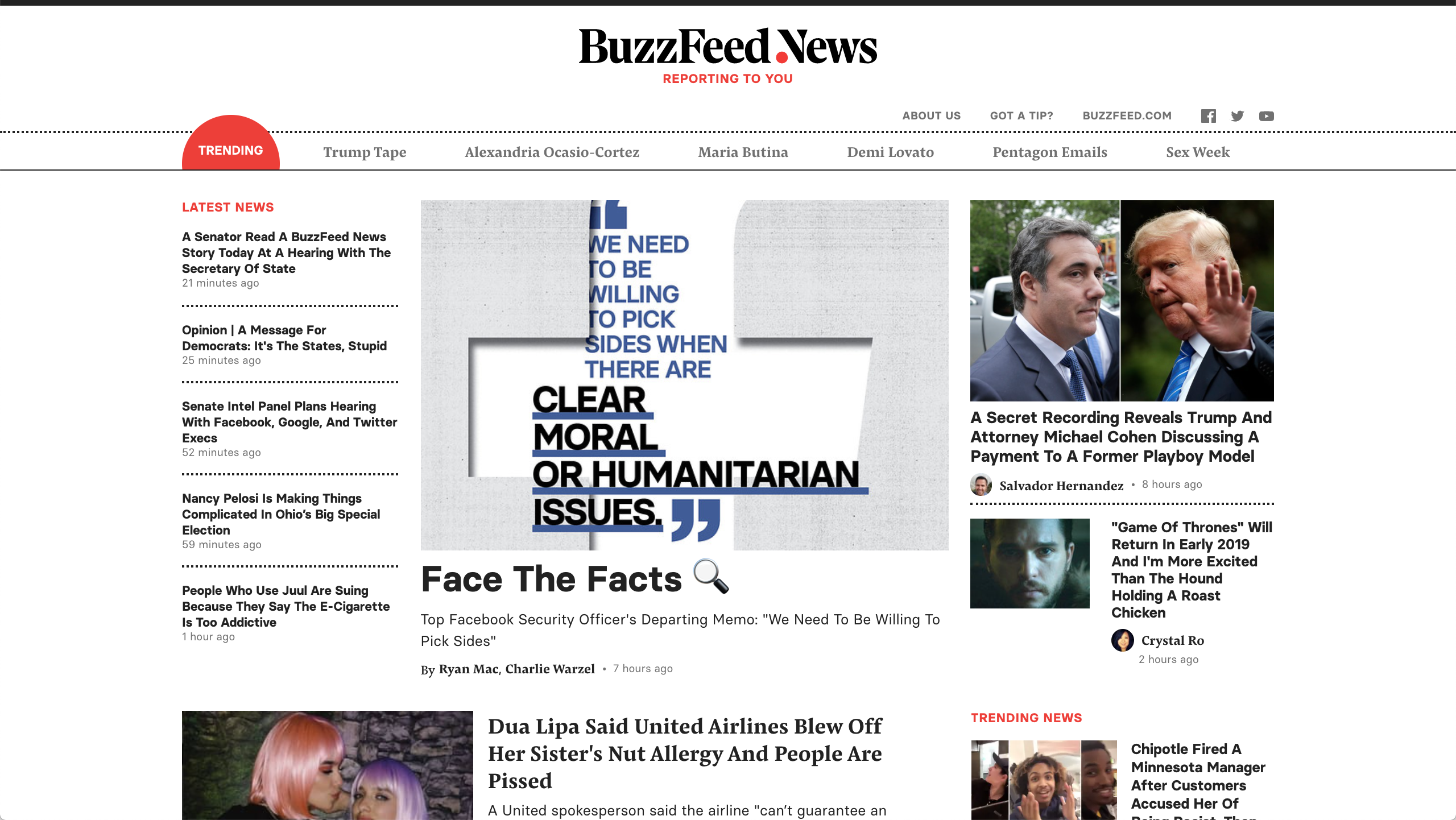
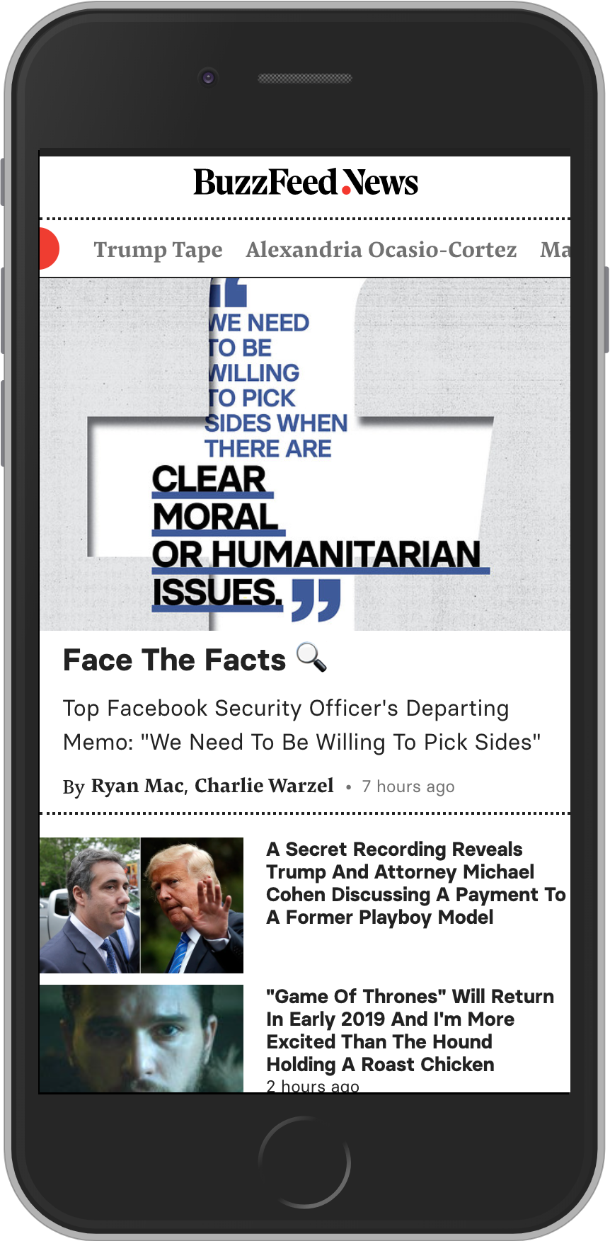
The BuzzFeed news website provides a constant stream of news content...

project
project

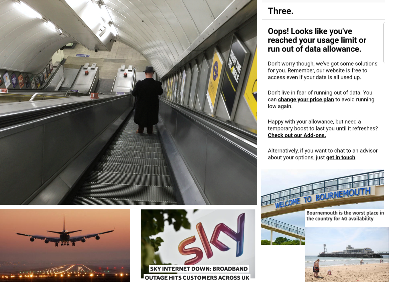
...but what happens when we lose internet connection?

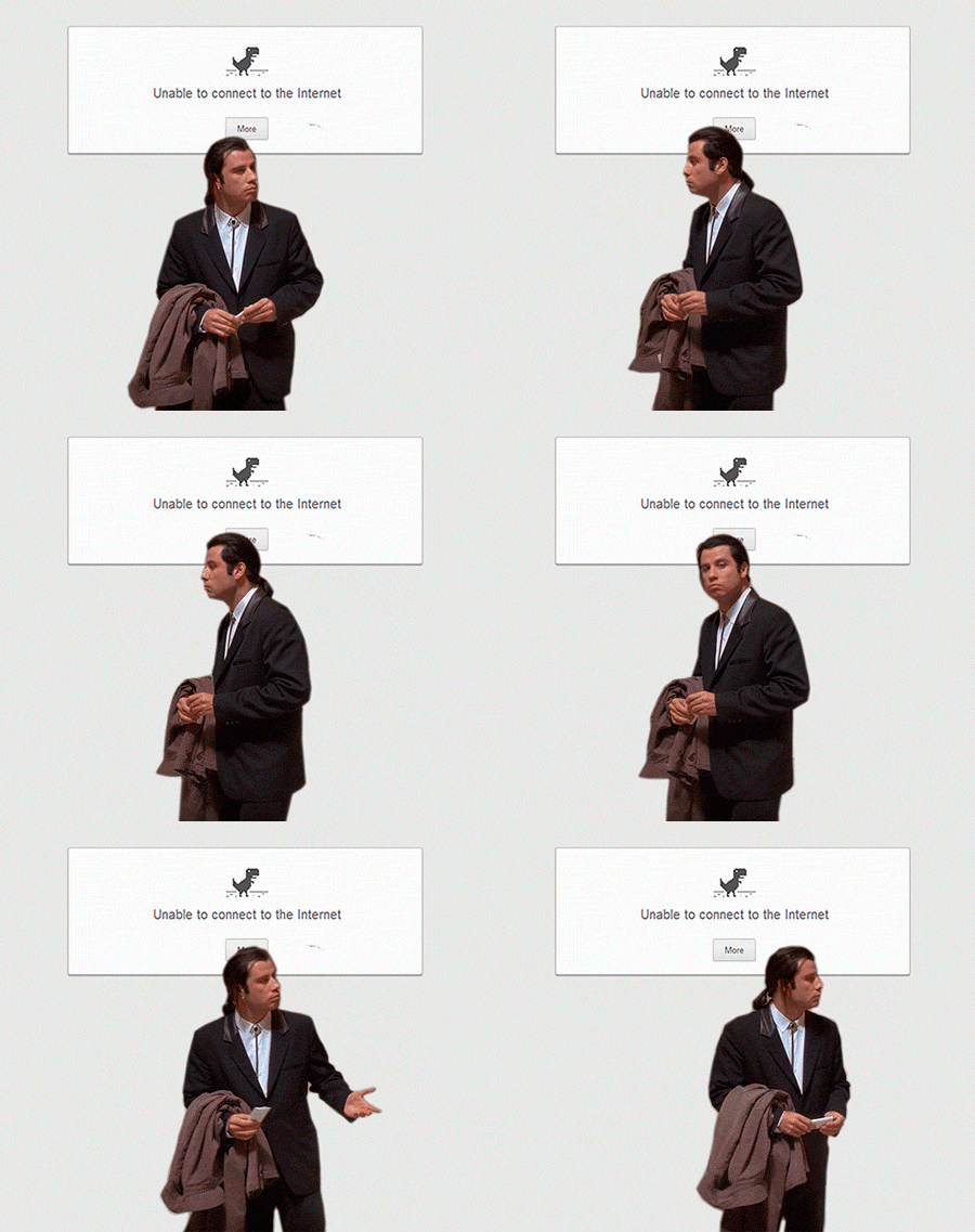
Probably something like this.

How might we improve this?

After investigating the web technology of "Service Workers" which allow websites to inject code onto a user's device to be executed if connection is lost, I started thinking about the possibility of providing an alternative offline experience.

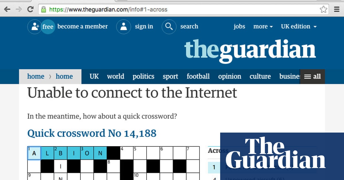
I started by exploring the offline pages of other websites. While most sites did not provide any offline page, the Guardian's offline crossword stood out to me as a great piece of opportunistic seamful design. Seamful design is where a designer acknowledges the "seams" that exist in a system (in this case the availability of an internet connection) and accounts for them into their design. In other words they plan for things that can cause a system not to function properly and design the user experience around this. To do so opportunistically means to use the seam as an opportunity to provide an alternative experience to the user.

I wanted to build on this idea of incorporating an element of fun into the offline page and give the user something to occupy their time whilst offline, making them more likely to remain on the site until they regain connection. Since the user would likely have visited the site with the intent of consuming news content, I decided to experiment with caching news content offline that could be loaded if the user lost connection. BuzzFeed News produces a daily newsletter which is a daily roundup of the biggest stories of the day. This gave me the idea of framing this as a "BuzzFeed daily newspaper", a lightweight, offline, update of news which could be delivered to the user's device daily.

Design & Prototyping

project
Early Design
project
Final Design

Working closely with designers, engineers and journalists from the news team I created a working prototype of the idea. This was a challenge on both a design and engineering level. It was a very interesting process collaborating with the BuzzFeed News designers and art team to finalise a design that would create the fun newspaper feel whilst reflecting the recently rebranded BuzzFeed News site. Additionally, the project required significant full stack software engineering to serve the newsletter data and cache it to the device effectively.